Disaster Slap Tower
I’m going to share some of the biggest mistakes I’ve made so far during the development of my game Disaster Slap Tower.
If you haven’t seen the previous blog, go ahead and check it out by clicking here.
Mobile Players
When I first added the simple shop UI on the right-hand side for the game that would let players purchase gamepasses, I used a pixel-based positioning system instead of percentage/ratio based.
This meant that if you were on a mobile device, the UI would be completely disproportionate to your screen size.

The UI blocked a quarter of the screen. That’s how bad it was.
Like aforementioned, this was quickly fixed by using percentage based positioning rather than pixels, which means the elements will be placed according to what percent of the screen it will take rather than how many pixels.

Impatience
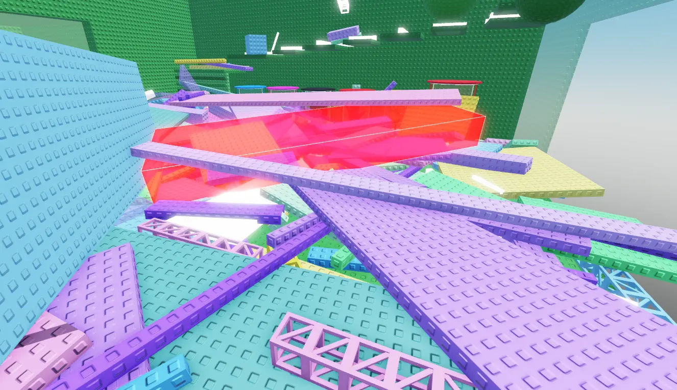
In the earlier stages of development, while we were messing with the Anvil Rain event, we genuinely managed to unanchor every single part in the game. This was published to the live version of the game too.

Crazy.
Luckily, we caught wind of this as soon as one of us joined to start a playtest session and realised that the obby tower collapsed in on itself like a controlled demolition
We managed to rollback the game before any players had joined and noticed, which could have hurt our reputation
I learnt the hard way not to rush through updates and carefully check every nook and cranny for any vulnerabilities or potential issues that may arise.

Terrible Optimisation
Another scenario that I completely overlooked was that, the game worked fine in Studio, on a single server hosted on my very powerful computer, with only ONE player – but when you start adding players and delay, it all adds up very quickly.
We only found out how terribly optimised the game initally was when a tester using his old Samsung joined and crashed within a minute of playing.
Safe to say that me and Jaden spent about 3 hours just abstracting unneeded and pointless functions/mechanics from the game just to squeeze every last bit of performance that we so desperately required.
Overcomplicating
When I came up with the button, it wasn’t as simple as I really said it was in that first blog. I made more four or five attempts prior to the final product which all fell short of one thing: simplicity.
I kept overcomplicating the code and adding far too many unnecessary loops and checks for some reason when all I should have done was come up with a simple flowchart, our lay out my logic in a clean structured way – and THEN try to code it.
The button is not a crazy idea! So don’t go crazy trying to code it!
Conclusion
Seems generic, but I mean this when I say it: mistakes aren’t failures – they’re part of the process. Listen to each problem properly and it will push you to keep improving your skills and creating a better experience.
Thanks for reading!


