Disaster Slap Tower
This blog is all about the creative process behind making all the graphics involved in my latest project Disaster Slap Tower!
If you haven’t seen the previous blog, go ahead and check it out by clicking here.
Icons
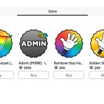
When newcomers first load into the game, one of the first things that they will notice is the random items in their inventory.
Since upon joining, ALL players receive a basic, weak slap hand, we need to make it clear to the player that it is a basic, weak slap hand.
What’s The Point?
These icons need to serve as a visual message to the player telling them what slap tool they currently have in their inventory.
This is vital to the game as if the player equips the wrong one in a fight, they may have to face climbing up the obstacle course all over again!
I made it my aim to ensure that each and every slap hand icon was clear, but not too flashy, as they were small and couldn’t fit enough detail in the space allowed by gear icons.
I had to carefully consider which approach I should take, whether it should be bright and grab your attention using vivid colours, or if it should be a bit more laid back and simple, but clear.
Choosing the Art Style
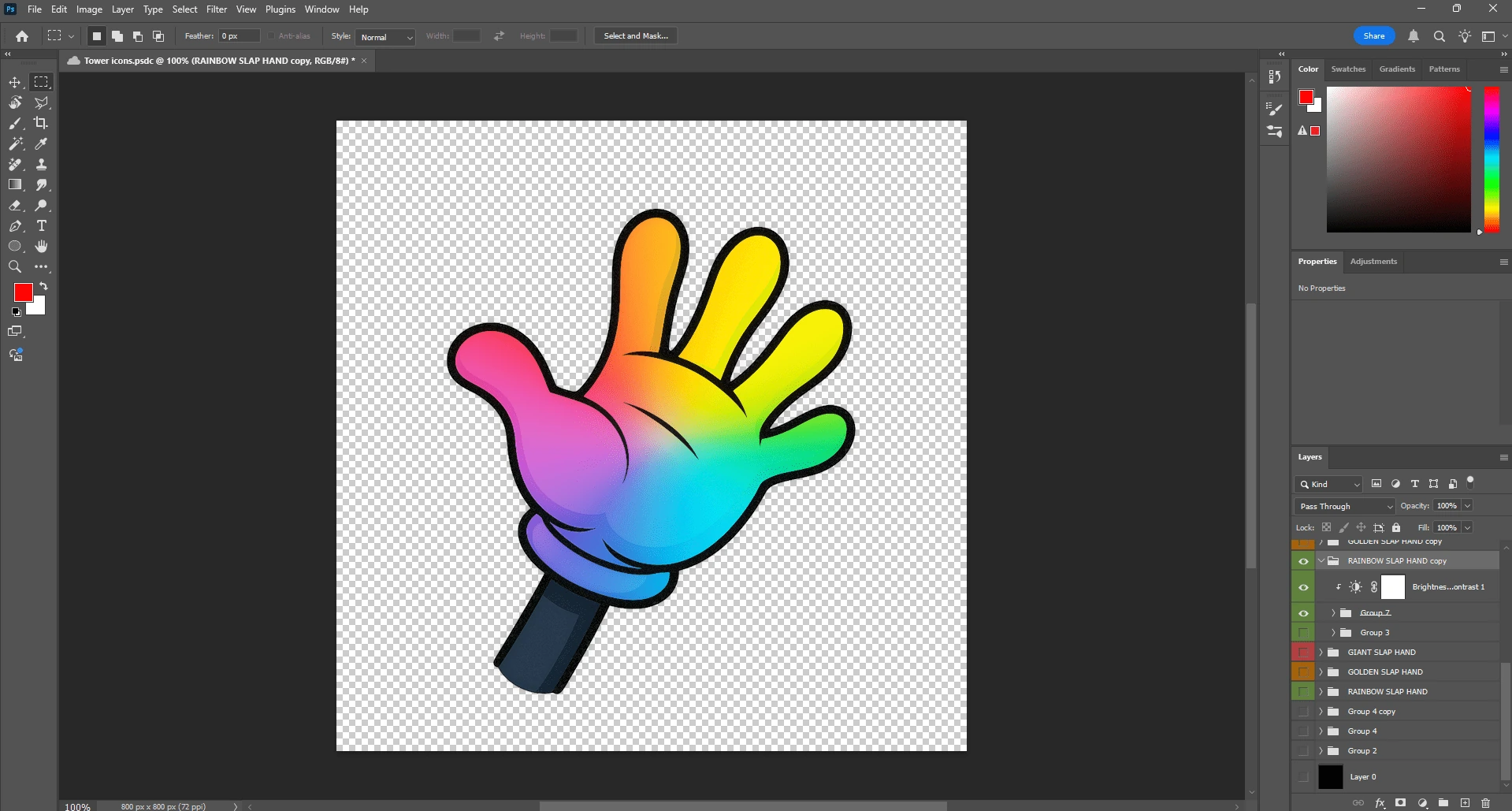
I decided on using a style that would mirror the cartoony aspect of these hands – a simple, 2D clipart of a gloved hand.


When drawing this, I used Slap Battles‘ icon as inspiration, since it perfectly encapsulated the elements I wanted to portray to the player – being clear and bright but not too over the top!
The key differences between mine (left) and Slap Battles (right) is that my icon includes a part of the arm, and is also brighter.
Software Used
I used Adobe Photoshop 2025 to create the icons, as opposed to using software like paint.net or Adobe Illustrator.
I deliberately chose Photoshop to be my tool of choice as it is a powerful and efficient image editing program, which makes it perfect for making eye-catching but clean icons for the slap icons that will represent each and every tool!
Tips
For those chasing success in game development, this is for you.
Here are a good set of principles to follow when creating icons for your tools in-game:
- Keep them simple. They must be recognisable at a glance
- Test them at smaller sizes. Consider the fact that a majority of the playerbase are on mobile!
- Be consistent – don’t switch up your style every 3 icons
- Contrast. Make sure you use sharp and defined colours
Individuality
In this section, I’m going to go through what choices I made to separate each slap hands from each other.
Glacier Slap Hand
I made a cool snowflake shape in photoshop and “sprinkled” it on top of the recoloured slap hand icon to show the frosty effect it leaves on players
I also put a bluish-icy gradient over to mimic the icy blue of a real, chilly glacier.

Golden Slap Hand
To push that idea of a glistening, 24 karat golden slap hand, I used a shining, metallic-like gradient consisting of faint golden shines with deeper golden hues mixed in there, trying to illustrate that shine that gold would have in real life.

Conclusion
All in all, I had to take good care in making these icons, as they serve as powerful tools in shaping the game’s feel, separating it from other lazy cash grabs.
Thanks for reading, and be sure to read the next blog in my series!